"A dashboard that makes leadership feel informed and a dashboard that actually informs leadership are not always the same thing."
A lot of capital project teams have Power BI dashboards. Fewer have dashboards that genuinely help anyone make a decision.
The difference is not about design. It is not about how many charts are on the page or how polished the color scheme looks. It is about whether the right information is surfaced in the right way for the people who need to act on it.
Here is what a good capital project dashboard actually shows, and what separates the useful ones from the ones that just look impressive in a kickoff meeting.
Cost vs. Budget at Multiple Levels
The most fundamental question on any capital project is whether you are on budget. A good dashboard answers that question clearly, at the project level, the WBS level, and by cost category, without requiring someone to dig through supporting schedules to find the number.
This means showing current actuals against the approved budget, the forecast at completion against that same budget, and the variance between them in both dollar and percentage terms. It also means showing this at a level of detail that is meaningful. A single total cost number tells leadership almost nothing. A breakdown by phase, work package, or discipline tells them where to look.
The dashboard should also make it immediately obvious whether a variance is trending better or worse over time. A cost overrun that is growing is a different conversation than one that has stabilized.
Schedule Performance That Reflects Reality
Schedule reporting is where dashboards most often fall short. Showing a Gantt chart is not schedule reporting. Showing a list of milestones with green and red flags is not much better.
A good dashboard shows schedule variance in a way that connects to cost and progress. That means earned value metrics where they are applicable, planned vs. actual progress curves, and a clear view of which activities are driving forecast slippage.
It should also show float consumption over time. A project that is technically on schedule but has burned through all its float is in a very different position than one with healthy contingency remaining. That distinction matters enormously to leadership and almost never appears on a standard status report.
Period Performance, Not Just Cumulative Totals
One of the most common gaps in capital project dashboards is the absence of period reporting. Cumulative cost and progress numbers are important, but they can mask what is actually happening right now.
A project that is five percent behind on a cumulative basis might be in good shape if performance has been improving in recent periods, or it might be accelerating toward a much larger overrun if the recent trend is heading the wrong direction.
Good dashboards show what happened this period alongside the cumulative picture. Period spending, period progress, period variance. This is what gives leadership a real read on project health rather than a lagging view of where things stood last quarter.
Risk and Issue Visibility
Most dashboards treat risk as a static table that gets updated when someone remembers to update it. A good dashboard integrates risk into the overall project health picture.
That does not mean displaying every line of the risk register. It means surfacing the risks that are currently active, showing their potential cost and schedule impact, and indicating whether mitigation actions are on track. Leadership should be able to see at a glance whether the risk picture is improving or deteriorating, not just that risks exist.
A View Built for the Audience
A dashboard that tries to serve everyone usually serves no one particularly well. Project controls teams need detail and the ability to drill down. Executive stakeholders need a high-level picture they can absorb in sixty seconds. Ownership and investors need confidence that the program is being actively managed.
A well-built reporting environment has views designed for each audience. The underlying data is the same. The presentation is not.
This is one of the things that separates a thoughtfully designed reporting system from a single dashboard that someone tried to make work for every conversation. Power BI makes it possible to build multiple views from the same data model. Using that capability well is a design and project controls judgment call, not a technical one.
What Is Usually Missing
In our experience working with capital project teams, the most common gaps in existing dashboards are period-level reporting, float consumption tracking, and a clear connection between schedule performance and cost performance.
These are not obscure metrics. They are the things experienced project controls professionals look at first when they want to understand what is actually happening on a project. The fact that they are missing from most dashboards usually comes down to one of two things: the data is not structured in a way that makes them easy to calculate, or the person who built the dashboard did not come from a project controls background.
Both are solvable problems. But solving them requires understanding what the metrics mean before worrying about how to display them.
How Queryon Approaches Dashboard Design
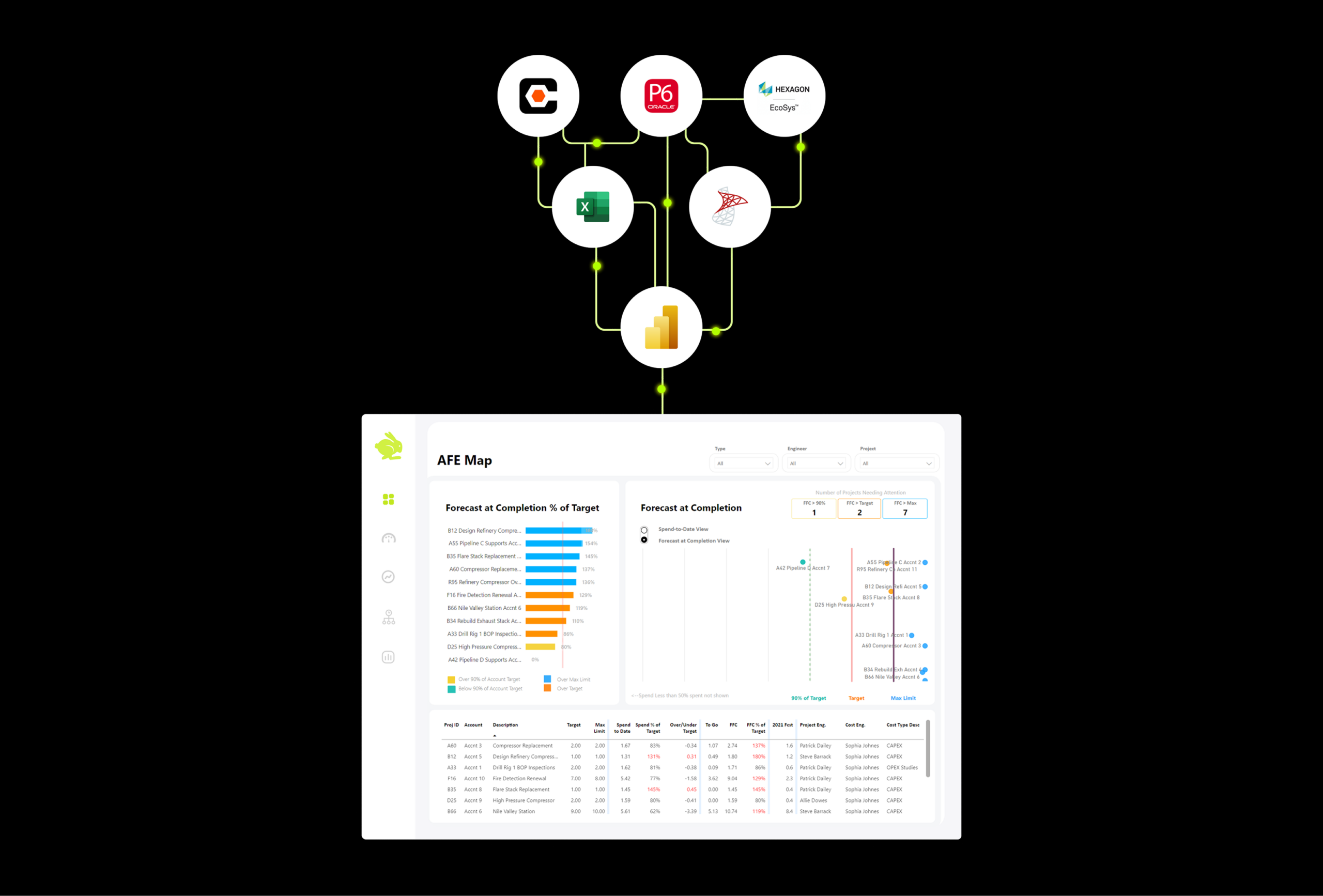
When we build reporting systems for capital project clients, we start with the reporting requirements, not the data. We map out what each audience needs to see, what decisions those views are meant to support, and what data is required to produce them accurately and automatically.
From there we work backward into the data architecture, making sure the pipelines and data model are built in a way that supports the reporting layer rather than constraining it. The result is dashboards that are not just visually clean but analytically correct, and that stay current without requiring someone to manually run an export every week.
If your current dashboards are missing the metrics that matter, or if you are starting from scratch and want to build something worth having, that is the conversation we are set up to have.